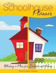
 I have been looking over the The SchoolHouse Planner by The Old Schoolhouse. It is an E book. I think it is quite possible that it is the ‘E’ part of the book that is causing me trouble.
 When I downloaded the book and started to virtually flip through the pages it felt awkward. I can’t just use my elbow to get it closer to my eyes if I can’t see it, I have to find the little magnifying glass icon and click on it, but not too many times because then it’s too close and I have to find the icon to make it zoom out.
So I thought about printing it out so I could really get a good look at it so I can give you my educated opinion. But it is 200 and some odd pages. Once I started looking through the types of forms and sheets that I would need printed out, I realized that would be a waste of paper and ink to print it all out.
It was at that point the whole E book started to make a little since to me. Honestly, for me homeschooling in Texas, The SchoolHouse Planner is too much. I don’t need all those forms and it would complicate my life instead of simplify it, but that’s me. You might really enjoy having all those forms in one place, easy to find and use.
So, in my brilliance I realized, that is the beauty of the E book. We all get the same choices, but without the waste. You print off what you need, I print off what I need, no wasted paper or ink, and there is not one more book taking up space on my book shelves.
Because I am not part of Generation X or Y or whatever letter the Internet generation has been assigned, all this digital stuff has a steep learning curve. But like most things, you get out of it what you are willing to put in.
After I became more familiar with the tools required to properly ‘turn the pages’ it became a little easier. It is basically broken down like this. Under each month is listed a recipe, an interesting little homeschooling teaching tidbit, and The SchoolHouse Store resource list for that month.
Here is an example from the table of contents for September. Each of those entries is a separate page that you can click on and go right to that page. That is a nice E book perk.
September 2008
Famous Composers
Tips for Teaching Writing
The Schoolhouse Store Resource List
September Super Salad
Green Chile
Then the forms begin, and they are many. They are categorized under Household Forms and Homeschool forms. Here are a few examples of some of the forms available under Household Forms: My Daily Schedule, Weekly Menu, Family Chore Chart, Family Health Information, Our Budget, Personal Finance Inventory, Dates to remember, Garden Plans, and many, many more.
Here are some of the forms available under the Homeschool Forms: Annual plans, Curriculum Goals, Educational Objectives, Yearly Grades, Lab Sheets, Unit Study, and Unschooling records just to name a few.
Then there are calendars. This is a feature I think I am really going to like. There are 08 and 09 calendars at a glance, there are school year calendars, and my favorite, large monthly calendars that allow me to type into the little boxes, then print out and keep in my curriculum binder. That is another nice feature of the E book, the ability to fill out the form you need, right there on the computer, then print out a nice official looking document.
For me, the E book took some getting used to. To be honest, I think I would still prefer the old fashioned paper and binding, but then I tend to have a hard time with change. I think the E book has its place among my homeschooling tools and I will enjoy it more as I continue to use it and its features. And as an added bonus, it is much easier to clean out my documents folder than it is my homeschooling book shelves.
All In all, I think I give the Homeschool Planner from The Old Schoolhouse an A.
You can go check it out here and get your own.


No comments:
Post a Comment